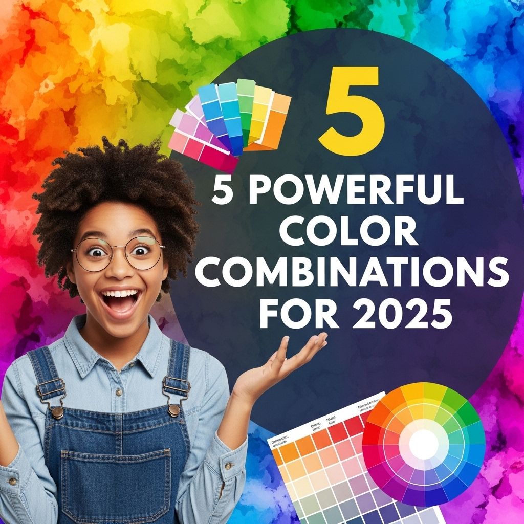
Top 10 Color Palette Ideas for 2025
Explore the top 10 color palette ideas for 2025 to enhance your design projects and stay ahead in trends. Discover vibrant combinations and inspiration.

As the world of design continues to evolve, color palettes play a crucial role in setting the tone and mood for various projects. Whether it’s for web design, interior décor, or graphic projects, understanding the trends in color can help you create visually stunning and impactful designs. In 2025, we can expect to see a blend of innovative colors that reflect modern aesthetics, technological advancements, and cultural influences. Below, we explore ten compelling color palette ideas that will dominate the design landscape in 2025.
As we look ahead to 2025, color palettes are set to evolve, embracing innovative hues and combinations that reflect contemporary trends and societal shifts. This article will explore the top 10 color palette ideas that not only capture aesthetic appeal but also resonate with the values and aspirations of the coming year. For those looking to enhance their branding, be sure to explore our logo mockup collection for inspiration.
1. Earthy Tones
With a growing emphasis on sustainability and nature, earthy tones are set to make a significant impact. These warm hues evoke a sense of grounding and serenity.
Key Colors:
- Terracotta
- Olive Green
- Muted Mustard
- Slate Blue
- Sand Beige
Usage Ideas:
This palette is perfect for:
- Interior design focused on natural materials
- Branding for eco-friendly products
- Websites promoting outdoor experiences
2. Futuristic Neons
As technology advances, so do the colors associated with it. Futuristic neons bring an exciting energy to designs, perfect for tech brands and digital platforms.
Key Colors:
- Electric Blue
- Neon Pink
- Vivid Lime
- Bright Orange
- Fluorescent Purple
Usage Ideas:
Consider this palette for:
- Product launches in tech industries
- Promotional materials for gaming and entertainment
- Websites aimed at a younger audience
3. Soft Pastels
Soft pastel colors are making a comeback, providing a soothing and inviting aesthetic that appeals to a wide audience.
Key Colors:
- Blush Pink
- Powder Blue
- Mint Green
- Lavender
- Peach
Usage Ideas:
This palette complements:
- Children’s products and services
- Wedding and event planning
- Beauty and wellness brands
4. Monochromatic Blues
Blue is often associated with trust and reliability. A monochromatic palette using various shades of blue can create a cohesive and professional look.
Key Colors:
| Shade | Hex Code |
|---|---|
| Light Sky Blue | #87CEFA |
| Dodger Blue | #1E90FF |
| Royal Blue | #4169E1 |
| Midnight Blue | #191970 |
| Steel Blue | #4682B4 |
Usage Ideas:
This palette works well for:
- Corporate branding
- Professional services websites
- Finance and legal industries
5. Vibrant Jewel Tones
Rich, jewel-like colors are making a splash as they convey luxury and sophistication, ideal for high-end brands.
Key Colors:
- Emerald Green
- Ruby Red
- Sapphire Blue
- Amethyst Purple
- Topaz Yellow
Usage Ideas:
These tones are great for:
- Fashion and luxury brands
- High-end product packaging
- Interior décor in upscale settings
6. Warm Neutrals
Warm neutrals provide a versatile backdrop for various designs, accommodating a wide range of color combinations.
Key Colors:
- Warm Taupe
- Soft Ivory
- Peachy Beige
- Dusty Rose
- Caramel
Usage Ideas:
This palette is ideal for:
- Home décor
- Branding for lifestyle products
- Web design emphasizing minimalism
7. Tech-Inspired Grayscale
Grayscale palettes, particularly those infused with subtle tech-inspired shades, are on the rise, providing a sleek and modern aesthetic.
Key Colors:
- Charcoal
- Slate Gray
- Silver
- Graphite
- Soft White
Usage Ideas:
Consider this palette for:
- Tech product branding
- Corporate communications
- Modern web and app design
8. Retro-Inspired Palettes
Retro colors are making a comeback, reflecting nostalgia while still being fresh and relevant.
Key Colors:
- Burnt Orange
- Avocado Green
- Pale Yellow
- Dusty Blue
- Coral
Usage Ideas:
This palette is perfect for:
- Branding for retro-inspired products
- Art and graphic design projects
- Event promotions with a nostalgic theme
9. Bold Contrasts
Combining contrasting colors can create dynamic visuals that grab attention and make a statement.
Key Colors:
- Black
- White
- Vibrant Red
- Lime Green
- Electric Blue
Usage Ideas:
This palette is ideal for:
- Advertising campaigns
- Event branding
- Web design that aims to stand out
10. Global Fusion
Inspired by global cultures, this palette combines colors from various traditions, celebrating diversity and creativity.
Key Colors:
- Turquoise
- Crimson
- Ochre
- Indigo
- Bright Coral
Usage Ideas:
Consider this palette for:
- Travel and cultural brands
- Art projects showcasing multicultural themes
- Food and beverage branding that embraces global flavors
In conclusion, the color palettes of 2025 reflect a fusion of nature, technology, and global influences. By embracing these trends, designers can create engaging, relevant, and emotionally resonant work that speaks to contemporary audiences. Stay ahead of the game by incorporating these palettes into your projects and watch as your designs come to life with color!
FAQ
What are the top color palette trends for 2025?
In 2025, expect to see vibrant and bold colors, along with calming earth tones and pastel shades that reflect sustainability and wellness.
How can I choose the right color palette for my home in 2025?
Consider your personal style, the mood you want to create, and the functionality of each space. It’s essential to blend colors that complement each other and fit your lifestyle.
What colors are considered calming for interior design in 2025?
Colors like soft greens, muted blues, and warm neutrals are popular for creating a calming atmosphere in interior spaces.
Are there any specific color palettes recommended for graphic design in 2025?
Yes, vibrant gradients, duotones, and earthy palettes are trending in graphic design, emphasizing creativity and connection to nature.
How do I incorporate the 2025 color trends into my wardrobe?
Start by adding key pieces in trending colors and mix them with your existing wardrobe. Accessories in bold colors can also elevate your outfits.
What is the significance of color psychology in 2025’s color palettes?
Color psychology plays a crucial role as certain colors evoke specific emotions and can influence mood, making it important to choose colors that align with your desired atmosphere.