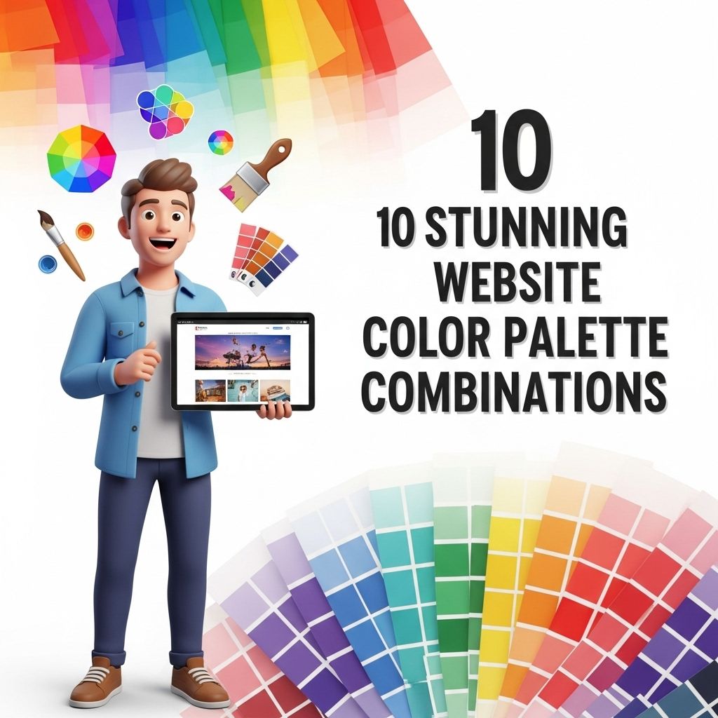
10 Stunning Website Color Palette Combinations
Discover 10 beautiful color palette combinations for your website that enhance design and user experience.
Choosing the right color palette for a website is crucial in defining its personality and creating an inviting atmosphere for visitors. Color not only enhances aesthetic appeal but also influences user behavior and perception. In this article, we’ll explore ten stunning color palette combinations that can elevate your web design, making it both visually striking and user-friendly.
Choosing the right color palette can profoundly impact your website’s aesthetics and user experience. In this article, we will explore 10 stunning website color palette combinations that can elevate your design to the next level. For those working on branding, you can find quality logo mockups for your projects to help visualize your ideas.
Table of Contents
Understanding the Importance of Color
Colors evoke emotions and set the tone for your brand. When applied strategically, they can guide users through their journey on your site, enhance readability, and improve the overall user experience. Here are a few reasons why colors matter:
- Brand Identity: Consistent use of color helps in building brand recognition.
- User Engagement: An appealing color scheme can keep users engaged longer.
- Emotional Connection: Different colors evoke different feelings, establishing a connection with your audience.
Elements of a Great Color Palette
When creating a color palette, consider the following elements:
- Harmony: Colors should complement each other.
- Contrast: Ensure there is enough contrast for readability.
- Brand Alignment: Colors should resonate with your brand’s message and audience.
Ten Stunning Color Combinations
1. Coral and Teal
This vibrant combination embodies a lively spirit ideal for creative enterprises or modern brands. Here’s how you can use it:
| Color | Hex Code |
|---|---|
| Coral | #FF6F61 |
| Teal | #008080 |
2. Classic Black and White
Timeless and elegant, this palette is perfect for luxury brands. It emphasizes simplicity and sophistication.
| Color | Hex Code |
|---|---|
| Black | #000000 |
| White | #FFFFFF |
3. Navy Blue and Gold
This combination is synonymous with professionalism and trust, making it suitable for corporate websites.
| Color | Hex Code |
|---|---|
| Navy Blue | #001F3F |
| Gold | #FFD700 |
4. Pastel Pink and Mint Green
Soft and inviting, these colors are perfect for brands targeting a younger demographic or those in the beauty and wellness sectors.
| Color | Hex Code |
|---|---|
| Pastel Pink | #FFB6C1 |
| Mint Green | #98FF98 |
5. Earthy Tones: Brown and Green
This palette is great for eco-friendly brands, as it reflects a connection to nature.
| Color | Hex Code |
|---|---|
| Brown | #8B4513 |
| Green | #228B22 |
6. Bold Red and Soft Gray
This combination offers a strong visual impact, ideal for tech startups and innovative companies. It blends energy with professionalism.
| Color | Hex Code |
|---|---|
| Red | #FF0000 |
| Gray | #A9A9A9 |
7. Vibrant Purple and Citrus Orange
These lively colors are great for brands aiming to capture attention and stand out. They are often used in entertainment and fashion.
| Color | Hex Code |
|---|---|
| Purple | #800080 |
| Orange | #FFA500 |
8. Soft Blue and Light Yellow
This combination creates a cheerful and calm atmosphere, ideal for educational and children’s websites.
| Color | Hex Code |
|---|---|
| Soft Blue | #87CEFA |
| Light Yellow | #FFFFE0 |
9. Aqua and Charcoal
Aqua brings a refreshing vibe, while charcoal adds depth and seriousness. This combination works well for modern brands.
| Color | Hex Code |
|---|---|
| Aqua | #00FFFF |
| Charcoal | #36454F |
10. Warm Beige and Deep Maroon
This rich combination exudes warmth and reliability, perfect for hospitality and lifestyle brands.
| Color | Hex Code |
|---|---|
| Beige | #F5F5DC |
| Maroon | #800000 |
Conclusion
The right color palette can make or break your website’s first impression. By selecting combinations that resonate with your brand and audience, you can create an engaging user experience. Consider testing different palettes through A/B testing to see which resonates best with your visitors. Embrace creativity and don’t shy away from mixing and matching colors to find the perfect combination that truly reflects your brand’s essence.
FAQ
What are the best color palette combinations for websites?
Some of the best color palette combinations for websites include complementary colors, analogous colors, and triadic colors. Popular combinations include blue and orange, green and yellow, and purple and gold.
How do I choose a color palette for my website?
To choose a color palette for your website, consider your brand identity, target audience, and the emotions you want to evoke. Use tools like Adobe Color or Coolors to explore and create color schemes.
What colors are best for a professional website?
For a professional website, it’s best to use neutral colors like navy, gray, and white, accented with a pop of color such as teal, orange, or burgundy to convey trust and sophistication.
Are there any color combinations to avoid in web design?
Yes, avoid color combinations that clash or create strain on the eyes, such as red and green or blue and yellow in high saturation. It’s also wise to avoid overly bright colors that can distract users.
How can I test my website color palette?
You can test your website color palette by creating mockups or using tools like UserTesting to get feedback from real users. Additionally, check contrast ratios to ensure readability.
What is the significance of color psychology in web design?
Color psychology plays a significant role in web design as different colors evoke different emotions and responses. Understanding color psychology can help you choose palettes that enhance user experience and engagement.