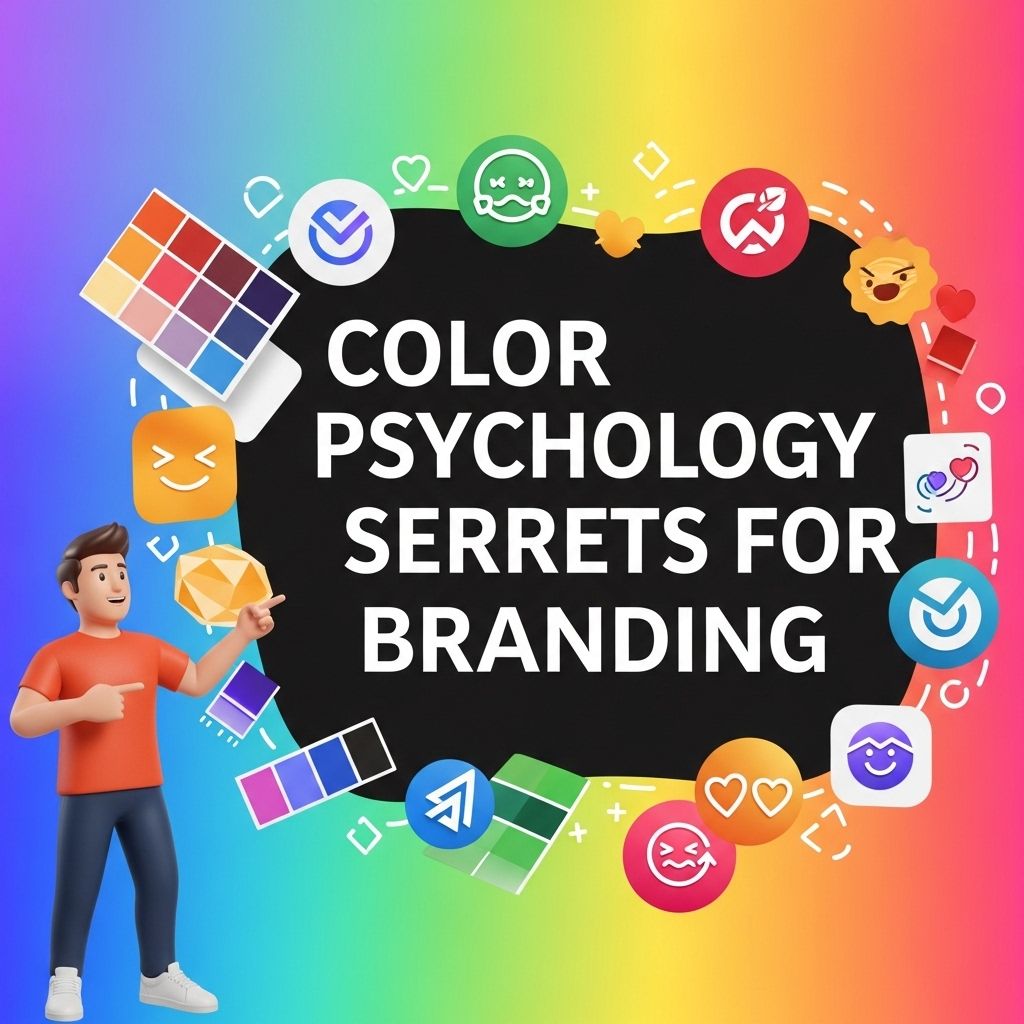
Unlocking Color Psychology for Effective Branding
Discover how color psychology can influence branding decisions and enhance your marketing strategy. Learn the secrets behind effective color choices.
Colors are an integral part of our lives, influencing our moods, perceptions, and decisions. In the realm of branding, understanding color psychology can significantly enhance the effectiveness of marketing strategies. By choosing the right colors, brands can evoke specific emotions, create memorable experiences, and establish a strong identity in a competitive market.
Color psychology plays a crucial role in shaping brand identity and consumer perceptions. By understanding the emotional responses elicited by different colors, brands can strategically choose hues that resonate with their target audience. Explore this further with resources that showcase effective logo mockup templates for your branding needs: browse logo mockup templates.
The Basics of Color Psychology
Color psychology is the study of how colors affect human behavior and emotions. Each color carries distinct meanings and associations, which can vary across cultures and contexts. Here are some fundamental principles:
1. Emotional Associations
- Red: Represents passion, energy, and urgency. Often used in clearance sales.
- Blue: Evokes feelings of trust, calm, and professionalism. Frequently used by banks and tech companies.
- Green: Symbolizes growth, health, and sustainability. Commonly seen in organic products.
- Yellow: Associated with happiness and optimism, but can also signify caution.
- Purple: Conveys luxury, creativity, and wisdom. Popular in beauty and premium brands.
2. Cultural Differences
It’s vital to consider cultural contexts when selecting colors for branding:
| Color | Western Meaning | Eastern Meaning |
|---|---|---|
| White | Purity, peace | Mourning, death |
| Red | Love, passion | Good fortune, happiness |
| Black | Elegance, formality | Misfortune, evil |
Choosing the Right Colors for Your Brand
When developing a color scheme for your brand, several factors should be considered:
1. Understand Your Audience
Knowing your target demographic is critical. Different ages, genders, and cultures respond uniquely to colors. Conduct surveys or focus groups to gather insights into their preferences.
2. Analyze Your Competitors
Examine the color schemes of competitors in your industry. This will help you to either align your branding with industry expectations or stand out with a unique palette.
3. Define Your Brand Personality
Your brand’s personality should reflect the emotions you want to convey. Here are some examples:
- Corporate: Blue, gray, black
- Friendly: Yellow, green, orange
- Luxury: Black, gold, purple
Creating a Color Palette
Once you’ve identified the primary colors, it’s time to create a palette. A good color palette typically consists of:
- Primary Color: The dominant color that represents your brand.
- Secondary Colors: Complementary colors that support your primary choice.
- Accent Colors: Colors used for highlights and calls to action.
For example, a tech company might use blue as the primary color for trust, accompanied by gray as a secondary color and orange as an accent for buttons and links.
Testing and Refinement
Choosing a color palette is not a one-time task. Regularly testing and refining your color choices based on user feedback and brand evolution is essential. Here are some methods:
A/B Testing
Implement A/B testing on your website or marketing materials. Use different color schemes to see which one resonates more with your audience. Monitor key performance indicators (KPIs) such as:
- Click-through rates (CTR)
- Conversion rates
- Engagement metrics
Gathering Feedback
Solicit feedback from customers through surveys or social media. Ask direct questions about how your branding makes them feel. This qualitative data can be invaluable in understanding the impact of your color choices.
Color Combinations and Their Impact
Different combinations of colors can convey varied messages and emotions. Here are some popular combinations and their uses:
1. Monochromatic Schemes
This scheme uses variations in lightness and saturation of a single hue. It creates a harmonious look but can sometimes lack contrast.
2. Complementary Colors
Opposite colors on the color wheel, such as blue and orange, create high contrast and attract attention, making them ideal for calls to action.
3. Analogous Colors
These are colors next to each other on the color wheel, such as blue, blue-green, and green. This scheme is soothing and works well for brands that want to communicate unity.
Real-World Examples
To illustrate the power of color psychology in branding, let’s look at some well-known brands:
1. Coca-Cola
The iconic red and white color scheme of Coca-Cola is synonymous with excitement and energy, reinforcing their branding message of fun and enjoyment.
2. Facebook
Facebook’s blue color palette conveys trust and reliability, essential for a social network that handles sensitive user information.
3. Starbucks
Starbucks uses a green palette that evokes feelings of growth and health, aligning perfectly with its brand image as a provider of sustainable coffee.
Conclusion
Understanding color psychology is essential for effective branding. The right colors can evoke emotions, convey messages, and create a memorable brand identity. By researching your audience, analyzing competitors, and continually testing your color choices, you can leverage color psychology to your advantage. As you innovate and grow, remember that the colors you choose speak volumes about who you are as a brand.
FAQ
What is color psychology in branding?
Color psychology in branding refers to the study of how colors affect perceptions and behaviors, influencing consumer emotions and decisions towards a brand.
How do different colors impact consumer behavior?
Different colors evoke different emotions; for example, blue is often associated with trust and reliability, while red can create a sense of urgency and excitement.
What colors are best for attracting customers?
Colors like blue, green, and orange are known to attract customers, with blue instilling trust, green representing growth, and orange encouraging impulse buying.
Can color choices affect brand loyalty?
Yes, consistent and strategic color choices can enhance brand recognition and loyalty, as consumers often develop emotional connections to colors associated with a brand.
How can I choose the right color for my brand?
To choose the right color for your brand, consider your target audience, the emotions you want to evoke, and the message or values you aim to convey.
Are there cultural differences in color perception?
Yes, color perception can vary significantly across cultures; for instance, white symbolizes purity in Western cultures but can represent mourning in some Eastern cultures.