
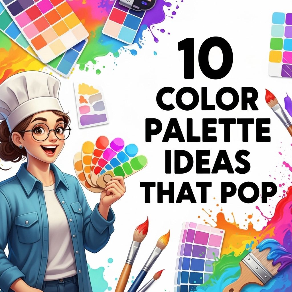
10 Vibrant Color Palette Ideas That POP
Discover 10 stunning color palette ideas that will make your designs pop and stand out. Perfect for branding, interior design, and more!
When it comes to design, color plays a pivotal role in creating an emotional response and visual appeal. Picking the right color palette can make or break a project, whether you’re designing a website, creating marketing materials, or redecorating a room. In this article, we will explore ten vibrant color palette ideas that will surely make your designs pop. Each palette will be accompanied by suggestions for use and combinations to help you harness the full potential of color in your work.
Color can make or break a design, especially when it comes to logos. In this article, we’ll explore 10 vibrant color palette ideas that truly pop, providing inspiration for your branding projects. For those seeking further design elements, explore our logo mockup collection.
1. The Bold and Bright Palette
This palette consists of striking colors that draw immediate attention. It’s perfect for projects aimed at a younger audience or for brands that want to convey energy and excitement.
- Electric Blue (#00A3E0)
- Neon Pink (#D5006D)
- Lime Green (#A8D800)
- Vivid Orange (#FF6B00)
Use these colors for:
- Events targeting a youthful demographic
- Sports teams or fitness brands
- Tech startups with a fun personality
2. The Earthy Tones Palette
For those who want a more grounded and organic feel, earthy tones provide warmth and comfort. This palette works well for brands focused on sustainability or those in the outdoor industry.
- Forest Green (#228B22)
- Burnt Umber (#8B4513)
- Sand (#C2B280)
- Sky Blue (#87CEEB)
Best used for:
- Nature-focused brands
- Health and wellness products
- Interior designs that emphasize natural materials
3. The Monochrome Magic
Monochrome palettes focus on variations of a single color, creating a cohesive and sophisticated look. This approach is ideal for luxury brands and minimalist designs.
Example using Blue:
- Light Blue (#B0E0E6)
- Medium Blue (#4682B4)
- Dark Blue (#00008B)
- Slate Blue (#6A5ACD)
Great for:
- Corporate branding
- High-end fashion
- Editorial layouts
4. The Retro Vibe
Bring a nostalgic charm to your designs with this retro color palette, reminiscent of the 70s and 80s.
- Tangerine (#FF8C00)
- Mauve (#EAB8D1)
- Turquoise (#40E0D0)
- Mustard Yellow (#FFDB58)
The retro palette is great for:
- Vintage-themed products
- Events with a throwback theme
- Designs that evoke nostalgia
5. The Pastel Dream
Soft pastel colors create a gentle and calming effect, perfect for brands related to beauty, parenting, or wellness.
- Pale Pink (#FFB6C1)
- Baby Blue (#BFEFFF)
- Mint Green (#98FF98)
- Lavender (#E6E6FA)
Utilize this palette for:
- Children’s products
- Beauty brands
- Invitations or stationery
6. The Classic Black and White
No color palette is more timeless than black and white. This combination evokes elegance and timelessness, making it suitable for upscale branding and design.
Variations include:
- Pure White (#FFFFFF)
- Deep Black (#000000)
- Charcoal Gray (#333333)
- Ivory (#FFFFF0)
Best for:
- Corporate identities
- Fashion brands
- Art galleries or museums
7. The Tropical Escape
Capture the essence of a tropical paradise with vibrant colors that exude warmth and relaxation. This palette is great for travel agencies and resorts.
- Coral (#FF7F50)
- Turquoise Blue (#00CED1)
- Sandy Beige (#F4A460)
- Sunshine Yellow (#FFD700)
Perfect for:
- Travel marketing
- Event planning companies
- Beachwear products
8. The Modern Neutral
In today’s design world, neutral palettes have become increasingly popular, providing a clean and sophisticated look. A modern neutral palette typically includes various shades of beige, gray, and taupe.
- Light Gray (#D3D3D3)
- Beige (#F5F5DC)
- Charcoal (#36454F)
- Warm Taupe (#D8BFD8)
Use this palette for:
- Minimalist web design
- Corporate branding
- Interior design projects
9. The Vibrant Contrast
Contrast in design can create dynamic visuals that capture attention and guide users. This palette focuses on complementary colors that enhance each other’s vibrancy.
- Royal Purple (#6A0DAD)
- Gold (#FFD700)
- Teal (#008080)
- Crimson (#DC143C)
Ideal for:
- Event promotions
- Artistic projects
- Branding that seeks to stand out
10. The Gradient Wonder
Gradients allow for smooth transitions between colors, creating depth and dimension in design. This palette can include a mixture of colors transitioning beautifully into one another.
For a stunning sunset gradient:
- Sunset Orange (#FF4500)
- Peach (#FFDAB9)
- Lavender (#E6E6FA)
Great for:
- Web backgrounds
- App interfaces
- Fashion designs
Conclusion
Choosing the right color palette can elevate your design, enhance user experience, and leave a lasting impression. The ten palettes discussed here offer a wide range of emotions and styles, catering to different needs and audiences. Experiment with these combinations, and don’t be afraid to create your own unique palettes that reflect your vision. Remember, the key to impactful design lies in understanding how colors interact and affect perception.
FAQ
What are color palettes?
Color palettes are collections of colors that work well together and can be used for design projects, branding, or artwork.
How do I choose a color palette that pops?
To choose a color palette that pops, consider using high-contrast colors, complementary hues, and vibrant shades that attract attention.
What are some popular color combinations for a bold palette?
Popular bold color combinations include teal and coral, navy and mustard, and magenta and lime green.
Can color palettes be used for web design?
Yes, color palettes are essential in web design to create visually appealing and user-friendly websites.
How can I create my own color palette?
You can create your own color palette by using online tools like Adobe Color, Coolors, or by drawing inspiration from nature, art, or photographs.
What colors work well for branding?
Colors that work well for branding depend on the message you want to convey; for example, blue suggests trust, while red evokes excitement.


