
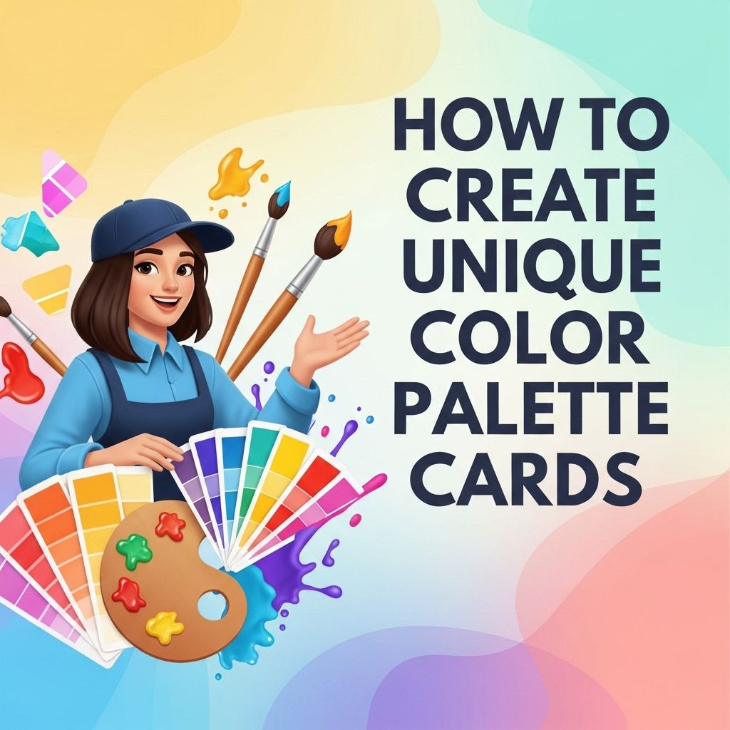
Create Unique Color Palette Cards Easily
Discover how to create stunning and unique color palette cards that inspire your design projects. Step-by-step guide included.
Creating unique color palette cards is a fundamental skill in design, art, and digital media. Color can evoke emotions, convey messages, and enhance the overall aesthetic of a project. Whether you’re a graphic designer, an artist, or just someone who appreciates color, learning how to craft mesmerizing color palette cards can enhance your work significantly. In this article, we will explore the steps to create unique color palette cards, various tools available, and some tips for effective color selection.
Creating unique color palette cards has never been easier, enabling designers to experiment with vibrant combinations that truly reflect their vision. By utilizing various online tools and inspiration sources, you can craft palettes that enhance your projects significantly. For further design resources, you might want to discover unique logo mockup ideas.
Understanding Color Theory
Before diving into the creation of color palette cards, it’s essential to understand basic color theory. Color theory provides a framework for understanding how colors interact with each other and how they affect the viewer’s perception.
Color Wheel Basics
The color wheel is a circular diagram that represents the relationships between colors. Here’s a brief overview:
- Primary Colors: Red, Blue, Yellow – cannot be created by mixing other colors.
- Secondary Colors: Green, Orange, Purple – created by mixing primary colors.
- Tertiary Colors: Yellow-Orange, Red-Orange, Red-Purple, Blue-Purple, Blue-Green, Yellow-Green – formed by mixing primary and secondary colors.
Color Harmonies
Color harmonies are combinations of colors that create visual interest. Some common types include:
| Harmony Type | Description |
|---|---|
| Analogous | Colors that are next to each other on the color wheel. |
| Complementary | Colors that are opposite each other on the color wheel. |
| Triadic | Three colors that are evenly spaced on the color wheel. |
| Tetradic | Four colors that form a rectangle on the color wheel. |
Gathering Inspiration
Before creating your color palette cards, gather inspiration from various sources. Here are some effective methods to find fresh color combinations:
- Nature: Observe the colors in your environment. Flowers, landscapes, and wildlife provide excellent color combinations.
- Art and Design: Browse through art galleries, design portfolios, and social media platforms like Pinterest and Instagram.
- Fashion: Look at seasonal collections, fabric swatches, and style guides.
- Photography: Explore color in photography—check out sites like Unsplash and Pexels for high-quality images.
Creating Your Color Palette Cards
Once you’ve gathered inspiration, it’s time to create your color palette cards. Follow these steps:
1. Choose Your Tool
There are various tools available for creating color palettes. Here are a few popular options:
- Adobe Color: A web application that allows you to create and save color palettes with various harmony rules.
- Coolors: A color scheme generator that allows users to generate color combinations quickly.
- Canva: A design tool that provides templates for creating color palettes and allows easy customization.
- Procreate: Great for digital artists, this app allows you to create custom color palettes on the iPad.
2. Select Your Colors
Using the tool of your choice, begin selecting colors. Consider the following:
- Use the color wheel to select harmonious colors.
- Select a dominant color and build around it.
- Experiment with saturation and brightness for variety.
3. Save Your Palettes
Always save your color palettes. Most tools allow you to export your palettes in various formats:
- Hex codes for web use
- RGB values for digital projects
- CMYK for print projects
4. Create Your Cards
Design your color palette cards. Here are some tips:
- Layout: Use a clean and organized layout to present your colors. A simple grid or row format works well.
- Labels: Include hex codes or color names for easy reference.
- Visual Elements: Add visual elements that represent the themes you want to convey, such as icons or imagery.
5. Get Feedback
Share your color palette cards with fellow designers or artists to get feedback. Constructive criticism can lead to improvements and new ideas.
Tips for Designing Effective Color Palettes
Here are some tips to ensure your color palettes are engaging and effective:
1. Consider the Audience
Your color choices should resonate with your target audience. Understand their preferences and the emotions you wish to evoke.
2. Use Color Psychology
Colors can influence emotions and perceptions. For instance:
- Red: Passion, excitement, urgency.
- Blue: Trust, calmness, professionalism.
- Green: Growth, harmony, health.
- Black: Elegance, sophistication, mystery.
3. Stay on Trend
Follow color trends within your industry. Websites like Pantone provide annual color trend forecasts that can guide your choices.
Conclusion
Creating unique color palette cards is a blend of art and science that requires understanding color theory, gathering inspiration, and utilizing the right tools. With practice and experimentation, you can develop a skill that not only enhances your projects but also empowers your creativity. Remember to seek feedback, stay informed about color trends, and always consider the emotional impact of your color choices. Happy designing!
FAQ
What is a color palette card?
A color palette card is a visual representation that showcases a selection of colors, typically used for design projects, branding, or artistic inspiration.
How do I choose colors for my palette cards?
To choose colors for your palette cards, consider the mood or theme you want to convey, use color theory principles, and explore tools like color wheel apps for guidance.
What tools can I use to create color palette cards?
You can use graphic design software like Adobe Illustrator, online tools like Canva, or color palette generators such as Coolors to create your color palette cards.
Can I create color palette cards for digital and print use?
Yes, you can create color palette cards for both digital and print use by selecting appropriate color modes (RGB for digital, CMYK for print) and ensuring color accuracy.
How can I make my color palette cards unique?
To make your color palette cards unique, experiment with unusual color combinations, incorporate textures or patterns, and add personal elements that reflect your style.
Are there any tips for sharing my color palette cards online?
When sharing your color palette cards online, use hashtags related to design, tag relevant communities, and consider creating a mood board to showcase your palettes in context.


