Tips For Minimalistic Graphic Design Skills
Minimalism embraces simplicity on every stage. The main aim of the minimalistic design is to grab the public eye on the contents and most essential elements, striking out all the distracting objects.
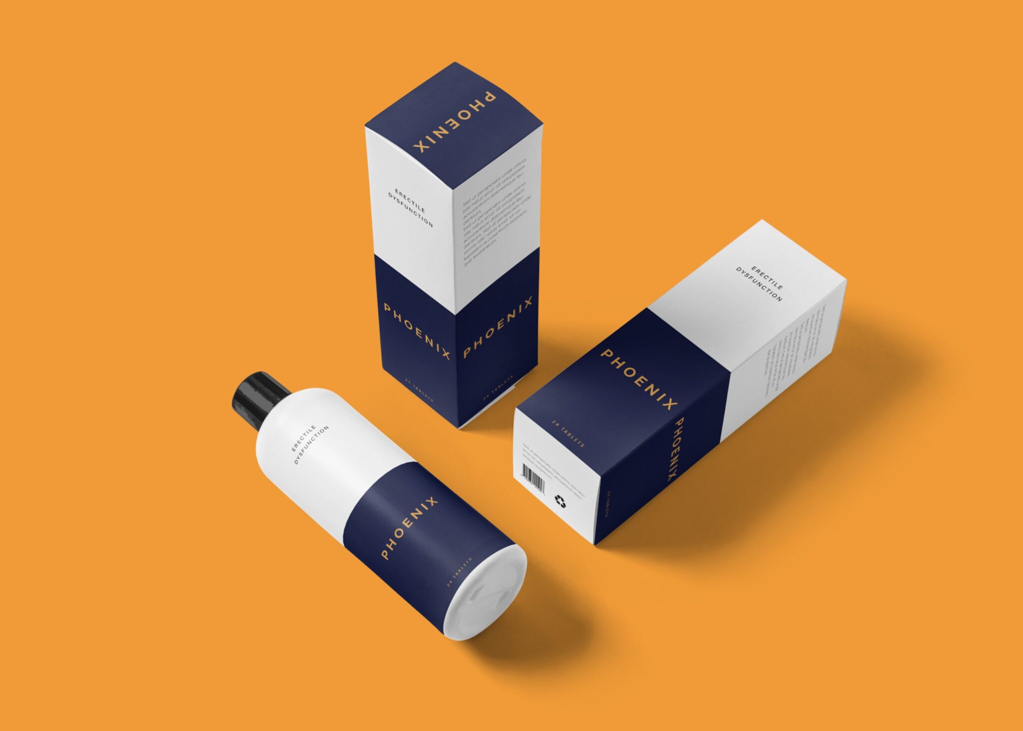
Minimalistic graphic design is all about achieving clarity and impact through simplicity. By focusing on essential elements, you can create striking visuals that communicate your message effectively. Utilizing resources like customizable bag mockups can enhance your design process while maintaining a clean aesthetic.

Even though the graphic designer has to build a basic design, sometimes it becomes hard to accomplish this. Since this design requires the same amount of clarity and performance as a regular design but with lesser elements.
Here are some basic key features which have to be followed while building a minimalistic graphic design. Usage of Maximum White Space, so that focus falls upon the content elements. Make clever use of the grid system. Keep it simple by choosing a Font and colour pallet limited. The topography grabs the utmost attention, as there are no much design objects on the frame. Thus, Topography has to be very clear and readable. Balance of spaces and placement of objects have to be maintained on the frame.
The user interface should not be complicated, every user just by a glance must easily understand the working and interactions with it. User must understand where to start from, the important details and the information flow. Every item on the frame must have plenty of space around it. We can use Images while designing. But these must be simple and not over crowded. It is not necessary that we use only white, we can also use some simple, non-competing colour pellet expressing our ideas.
After completing the whole design, one must go through each and every element and double verify its purpose and importance and discard the non-needed ones. Make it most creative with the minimum resources. Keep playing with the templates and elements until you come up with a design that portrays your vision.