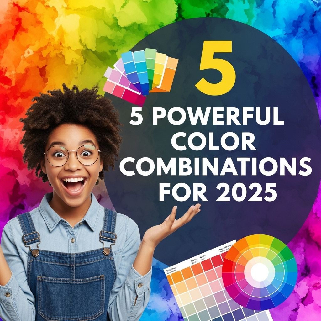
5 Powerful Color Combinations for 2025
Discover the top 5 color combinations that will dominate in 2025 and elevate your design projects with vibrant and trendy palettes.
As we step into 2025, the significance of color in design continues to play a pivotal role in influencing emotions, perceptions, and branding. With the rapid evolution of technology, cultural shifts, and design trends, color palettes are becoming increasingly essential for businesses and designers alike. This article explores five powerful color combinations that are expected to dominate in 2025, providing insights into their applications and emotional impacts.
As we step into 2025, the world of design is evolving with vibrant and impactful color combinations that can elevate any project. From bold contrasts to soothing palettes, these five powerful color pairings are set to dominate the visual landscape this year. To bring your ideas to life, consider exploring options where you can find quality logo mockups for your projects.
The Psychology of Color
Understanding the psychology behind color is crucial for designers who wish to evoke specific emotions and reactions from their audience. Colors are not just aesthetic choices; they carry implications that can significantly affect consumer behavior. Below are some key points on how colors influence perception:
- Red: Energy, passion, and urgency.
- Blue: Trust, calmness, and professionalism.
- Green: Growth, health, and tranquility.
- Yellow: Optimism, clarity, and warmth.
- Purple: Creativity, luxury, and spirituality.
1. Coral and Teal
This vibrant combination offers a stunning visual contrast, with coral bringing warmth and energy while teal adds a calming touch. Ideal for brands focused on creativity and modernism, this palette can be applied across various industries, from tech to fashion.
Applications:
- Website design for creative agencies
- Marketing materials for lifestyle brands
Emotional Impact:
This duo can inspire feelings of enthusiasm and creativity, encouraging users to engage and explore.
2. Navy and Mustard
This combination brings a sophisticated yet playful vibe. Navy represents stability and confidence, while mustard adds a touch of brightness and cheerfulness. Perfect for startups aiming to present a bold identity, this palette can also be used effectively in corporate settings.
Applications:
- Brand identity for tech startups
- Corporate presentations and reports
Emotional Impact:
The contrast of these two colors can evoke feelings of assurance and optimism, making them suitable for brands that wish to convey reliability with a fresh twist.
3. Lavender and Mint Green
This soft and soothing combination is anticipated to gain traction in the wellness and beauty industries. Lavender, with its calming effects, pairs beautifully with mint green’s refreshing qualities, creating a serene and inviting aesthetic.
Applications:
- Packaging design for skincare products
- Interior design for wellness centers
Emotional Impact:
The combination promotes relaxation and balance, ideal for brands focusing on self-care and rejuvenation.
4. Charcoal and Rose Gold
A modern and luxurious pairing, charcoal brings sophistication while rose gold adds warmth and elegance. This color combination is particularly appealing to high-end brands and lifestyle products, conveying a sense of modern luxury.
Applications:
- Luxury jewelry branding
- High-end home decor
Emotional Impact:
This duo can invoke feelings of elegance and exclusivity, attracting a clientele that appreciates quality and style.
5. Bright Orange and Slate Gray
This dynamic contrast creates a vibrant yet grounded aesthetic. Bright orange is energetic and attention-grabbing, while slate gray provides a neutral backdrop that balances the vibrancy. This combination is excellent for tech companies looking to showcase innovation alongside reliability.
Applications:
- Web design for tech startups
- Marketing campaigns for innovative products
Emotional Impact:
The vibrancy of orange conveys excitement and enthusiasm, while gray adds professionalism and dependability.
Conclusion
As we enter 2025, the selection of color combinations plays a crucial role in the visual identity of brands. By embracing these powerful palettes, designers can create impactful and memorable experiences that resonate with audiences. Understanding the psychological effects of colors and their applications in various industries will be paramount in crafting successful designs that stand out in a competitive landscape.
Whether you are designing a website, crafting marketing materials, or developing a brand identity, keeping these combinations in mind will allow for innovative and effective design solutions that capture the essence of your brand while appealing to your target audience.
FAQ
What are the top color combinations for 2025?
Some of the top color combinations for 2025 include deep teal and coral, mustard yellow and navy blue, soft lavender and sage green, burnt orange and cream, and bold red and charcoal gray.
How can I incorporate these color combinations into my home decor?
You can incorporate these color combinations into your home decor by using accent walls, decorative pillows, artwork, and furniture pieces that feature these colors.
Are there any specific trends influencing color choices in 2025?
Yes, trends such as sustainability, biophilic design, and a focus on mental wellness are influencing color choices in 2025, promoting calming and earthy tones.
What colors should I avoid in 2025?
In 2025, it’s best to avoid overly bright or neon colors that may clash with the trending earthy and muted tones favored for a more serene atmosphere.
Can these color combinations work for branding and marketing?
Absolutely! Using powerful color combinations can enhance brand identity and appeal, making your marketing materials more visually engaging.