
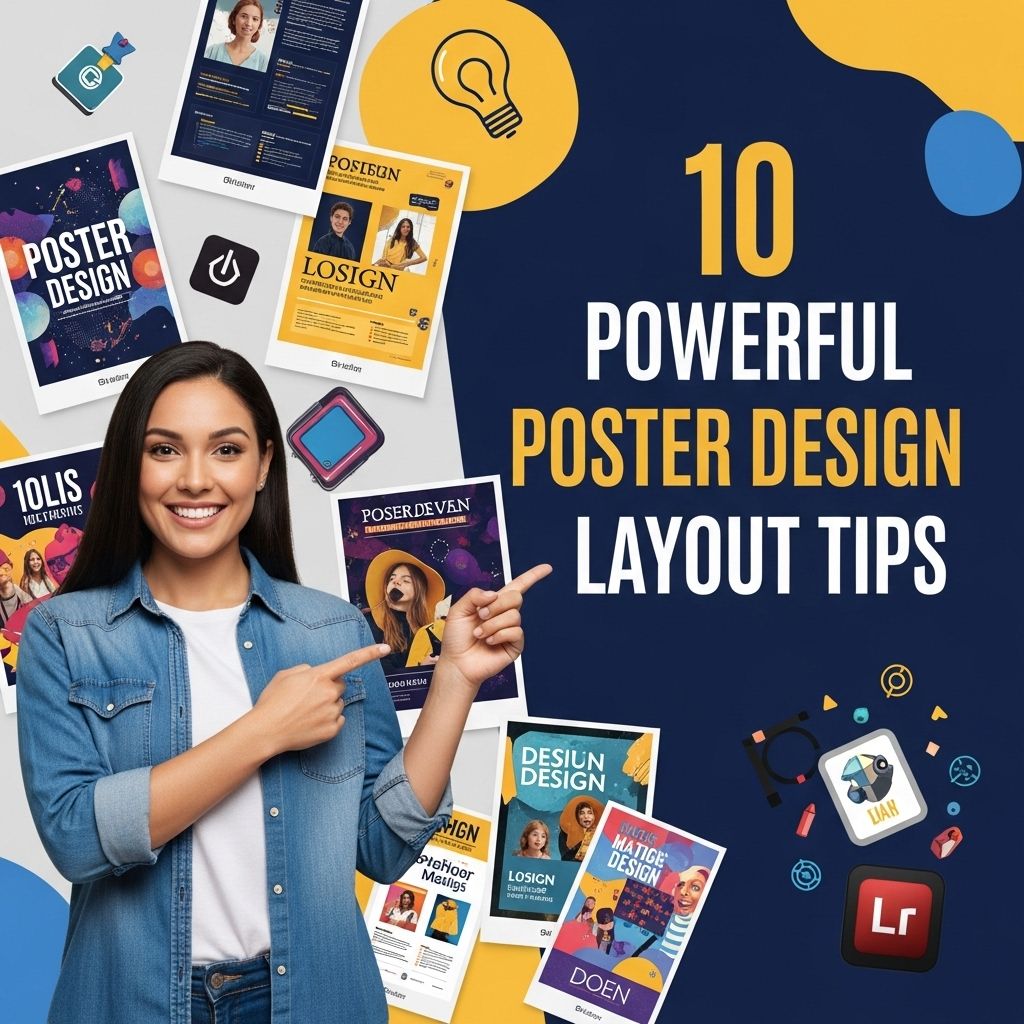
10 Powerful Poster Design Layout Tips
Discover 10 essential tips for creating impactful poster designs that captivate and engage your audience effectively.
Creating an impactful poster requires more than just a catchy headline and vibrant colors. A well-structured layout can significantly enhance the effectiveness of your design, engaging viewers and effectively conveying your message. In this article, we will explore ten powerful poster design layout tips that can elevate your designs and make them more visually appealing and communicative.
Creating an impactful poster requires a keen understanding of layout principles to capture attention and convey your message effectively. This guide will explore 10 powerful poster design layout tips to enhance your visual communication skills. For inspiration, you can also browse logo mockup templates.
Table of Contents
1. Understand the Purpose of Your Poster
Before diving into design, it’s crucial to understand the primary purpose of your poster. Ask yourself:
- What message do I want to convey?
- Who is my target audience?
- What action do I want viewers to take?
Having clear answers to these questions will guide your design choices and help you create a focused layout.
2. Use the Rule of Thirds
The Rule of Thirds is a fundamental principle in design that suggests dividing your poster into a grid of nine equal sections. This technique allows you to position key elements along the grid lines or at their intersections, creating a more balanced and engaging layout.
How to Apply the Rule of Thirds:
- Divide your canvas into thirds horizontally and vertically.
- Place crucial visual elements at the intersections to draw attention.
- Avoid centering all elements, as this can lead to a static composition.
3. Create a Hierarchy of Information
Effective posters guide viewers through their content. Establishing a clear hierarchy helps prioritize information and makes it easier for the audience to digest.
Ways to Create Hierarchy:
- Use different font sizes: Larger fonts for headlines, medium for subheadings, and smaller for body text.
- Incorporate contrasting colors: Highlight key information using bold colors that stand out.
- Utilize spacing: Adequate white space can emphasize important elements and provide a cleaner look.
4. Balance Text and Imagery
A successful poster design finds the right balance between text and imagery. Overloading a design with either can confuse viewers or dilute the message.
Tips for Balancing Text and Imagery:
- Integrate images that support the message rather than distract from it.
- Limit the amount of text—aim for clarity and conciseness.
- Use graphics, icons, or infographics to convey complex ideas visually.
5. Select an Appropriate Color Scheme
Color plays a pivotal role in how your audience perceives your message. A well-chosen color scheme can evoke emotions and create a cohesive look.
Choosing Colors Wisely:
- Limit your palette: Stick to 2-4 primary colors to maintain harmony.
- Consider color psychology: Research how colors influence emotions and choose those that align with your message.
- Test visibility: Ensure text is legible against the background color.
6. Utilize Grids for Alignment
Grids offer structure and organization, making it easier to align elements symmetrically. A well-aligned design looks professional and polished.
Benefits of Using Grids:
- Consistency: All elements can align well, enhancing visual flow.
- Control: Grids provide a framework that guides placement without overwhelming creativity.
- Efficiency: Speed up the design process by having a ready-made structure.
7. Incorporate Visual Flow
Visual flow directs the viewer’s eye through the poster. This is essential in ensuring that the audience absorbs the information in a logical order.
Creating Visual Flow:
- Use directional lines: Arrows, lines, or pathways can lead the viewer’s eye.
- Vary element sizes: Larger elements tend to attract attention first, guiding the order of viewing.
- Consider readability: Ensure the flow doesn’t compromise the clarity of text.
8. Include Call-to-Action (CTA)
A compelling CTAs prompt the audience to take the next step, whether it’s attending an event, visiting a website, or making a purchase.
Designing an Effective CTA:
- Make it visible: Use contrasting colors and bold fonts.
- Be concise: Keep the message clear and action-oriented.
- Position strategically: Place the CTA where it naturally follows the viewer’s flow.
9. Test and Iterate
Once you’ve created your poster, testing it can provide valuable insights. Gather feedback from potential viewers and make adjustments accordingly.
Effective Testing Methods:
- Conduct surveys: Use tools like Google Forms to gather input on design choices.
- Use A/B testing: Compare two versions of a poster to see which resonates more.
- Observe reactions: If possible, show it to your target audience and gauge their initial responses.
10. Keep It Simple
Finally, simplicity is key in poster design. Avoid clutter and overly complex layouts that can overwhelm viewers. Aim for clarity and focus.
How to Simplify Your Design:
- Limit text: Use short phrases or bullet points instead of long paragraphs.
- Choose a focal point: Use one main image or statement to draw attention.
- Eliminate unnecessary elements: Remove anything that doesn’t contribute directly to your message.
Conclusion
Effective poster design is a blend of creativity, strategy, and understanding your audience. By applying these ten powerful layout tips, you can create posters that are not only visually striking but also communicate your message clearly and effectively. Remember to test your designs, gather feedback, and always aim for simplicity in your approach. Happy designing!
FAQ
What are the key elements of an effective poster design?
The key elements include a clear focal point, balanced layout, effective use of color, readable typography, and appropriate images or graphics.
How important is color in poster design?
Color is crucial in poster design as it helps convey emotions, attract attention, and create visual hierarchy.
What typography tips should I follow for my poster?
Use legible fonts, maintain a hierarchy with font sizes, and limit the number of different fonts to ensure clarity and visual coherence.
How can I create a balanced layout for my poster?
Utilize the rule of thirds, ensure even spacing between elements, and group related items together to create a harmonious design.
What role do images play in poster design?
Images can enhance the message, attract viewers, and create emotional connections. They should be high quality and relevant to the content.
How do I ensure my poster is visually appealing?
Combine all design elements thoughtfully, maintain consistency in style, and consider the target audience to make the poster inviting and engaging.


