
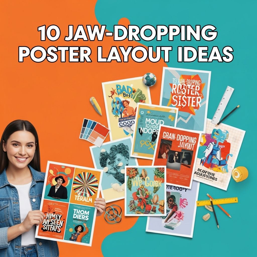
Creating stunning poster layouts can significantly enhance the effectiveness of your message, whether for advertising, events, or artistic expression. A well-designed poster not only grabs attention but also communicates the essence of the content clearly and creatively. In this article, we will explore ten innovative poster layout ideas that can elevate your design game and inspire creativity.
When creating a striking poster, the layout can make all the difference in capturing attention and conveying your message effectively. From bold typography to creative use of space, there are countless ways to transform a simple design into something jaw-dropping. Explore innovative approaches and layouts that can elevate your poster designs, such as those found in unique logo mockup templates, to inspire your next project. browse logo mockup templates
Table of Contents
Understanding Poster Layouts
Before diving into specific layout ideas, it’s essential to grasp the fundamental principles of poster design. A successful poster layout includes:
- Hierarchy: Guide the viewer’s eye through a logical flow of information.
- Contrast: Use contrasting colors and fonts to make elements stand out.
- Alignment: Ensure all elements are aligned for a polished look.
- White Space: Utilize white space effectively to avoid clutter and enhance readability.
1. The Minimalist Approach
Less is more in the minimalist design, focusing on essential elements to convey the message. Here are some tips for achieving a minimalist poster:
- Limit the color palette to two or three shades.
- Use a single bold font for the title.
- Incorporate ample white space around text and images.
Example
A simple event poster featuring a large, central image with minimal text can effectively draw attention without overwhelming the viewer.
2. The Grid System
Utilizing a grid system can help organize content systematically. This layout is particularly effective for information-heavy posters, such as those displaying statistics or event schedules.
How to Implement:
- Divide the poster into a grid of rows and columns.
- Place different elements within each grid cell.
- Maintain consistent margins and spacing for uniformity.
Benefits
This approach provides clarity and ensures that the information is easy to digest.
3. The Asymmetrical Layout
An asymmetrical layout breaks away from traditional symmetry, offering a dynamic and modern feel. This can be a powerful technique when done correctly.
Tips for Success:
- Balance visual weight by distributing elements unevenly.
- Use contrast and color to draw attention to key areas.
4. The Typography-Centric Design
Focusing on typography can create a striking visual impact. This design emphasizes font choices and styles to convey the message effectively.
Best Practices:
- Use a mix of serif and sans-serif fonts for contrast.
- Play with font sizes to create a hierarchy.
- Incorporate typographic elements like quotes or statistics creatively.
5. The Collage Style
The collage style combines various images, textures, and graphic elements into one cohesive design. This approach is particularly suitable for artistic or promotional posters.
How to Create a Collage:
- Gather a variety of visuals that relate to your theme.
- Layer images and textures to create depth.
- Ensure elements are harmoniously blended using color grading or filters.
6. The Infographic Style
Infographic posters are perfect for presenting data and information in an engaging manner. They simplify complex ideas through visuals.
Key Elements:
- Use icons and graphics to represent data points.
- Incorporate charts and graphs for visual representation.
- Keep text concise and informative.
7. The Retro Design
Embrace nostalgia with a retro design that resonates with a specific era. This style can evoke emotions and connect with your audience on a personal level.
Design Tips:
- Choose a color palette that reflects the chosen era.
- Use vintage fonts and textures to enhance authenticity.
8. The Color Block Layout
Color blocking is a vibrant and contemporary approach that involves dividing the poster into sections of different colors. This can create visual interest and draw attention to various content areas.
Implementation Steps:
- Select a bold color palette.
- Divide the poster into sections, each with a distinct color.
- Ensure text is legible against the background colors.
9. The Photography Focus
Utilizing high-quality photographs as the main element of your poster can create an emotional impact and leave a lasting impression.
Best Practices:
- Choose striking images that relate to your theme.
- Overlay text sparingly to maintain the photo’s impact.
10. The Interactive Poster
With the rise of technology, interactive posters have become a novel way to engage audiences. Incorporating QR codes or augmented reality elements can create an immersive experience.
How to Make it Interactive:
- Add QR codes that link to websites or videos.
- Incorporate AR elements that enhance the poster’s message.
Conclusion
Designing a captivating poster requires creativity and a keen understanding of layout principles. By exploring these ten jaw-dropping poster layout ideas, you can find the perfect style that resonates with your audience and effectively conveys your message. Embrace your creativity and let your posters stand out in a crowded space!
FAQ
What are some creative poster layout ideas?
Some creative poster layout ideas include asymmetrical designs, grid layouts, minimalistic styles, typographic posters, and layered images.
How can I make my poster eye-catching?
To make your poster eye-catching, use bold colors, striking images, and clear, concise text. Incorporate unique shapes and layouts to draw attention.
What elements should I include in a poster for maximum impact?
Include a strong headline, engaging visuals, informative content, and a clear call to action for maximum impact.
What is the importance of white space in poster design?
White space helps to create balance, improves readability, and allows important elements to stand out, making your poster more visually appealing.
How can typography enhance my poster layout?
Typography can enhance your poster layout by establishing hierarchy, conveying the mood, and making the information more accessible and engaging.
What should I consider when choosing colors for my poster?
Consider the emotional impact of colors, ensure good contrast for readability, and align color choices with your brand or message for a cohesive look.


