
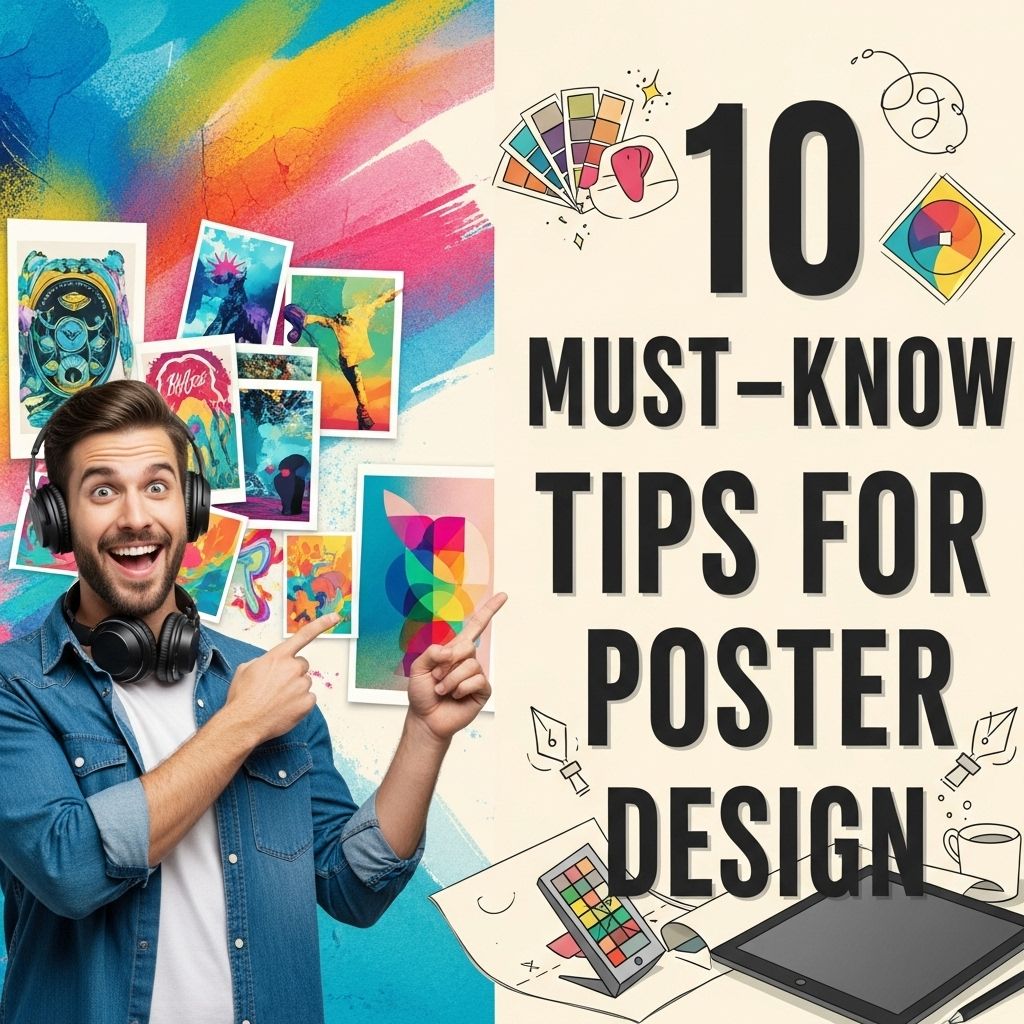
10 Essential Tips for Stunning Poster Design
Discover 10 must-know tips for creating eye-catching poster designs that attract attention and effectively communicate your message.
Designing an eye-catching poster is not merely an art; it is a strategic endeavor that involves understanding visual communication, audience psychology, and technical skills. Whether you’re promoting an event, launching a product, or sharing important information, a well-designed poster can make all the difference. In this article, we’ll explore essential tips that will elevate your poster design skills to the next level.
Creating stunning posters requires a blend of creativity and technical skill. To help you elevate your design game, we’ve compiled 10 essential tips that cover everything from layout to color choices. For those interested in incorporating logos effectively, be sure to learn how to use logo mockups effectively as part of your design toolkit.
Table of Contents
Understand Your Audience
Before diving into the design process, it’s crucial to understand who your audience is. Identifying your target demographic will help guide your design decisions.
Key Questions to Consider:
- What age group is your target audience?
- What are their interests?
- What is the primary message you want to convey?
By answering these questions, you can tailor your poster’s content, tone, and aesthetics accordingly.
Keep It Simple
One of the golden rules of poster design is to keep it simple. The primary goal of a poster is to communicate a message quickly and effectively. Overcrowding your design with text or images can lead to confusion.
Tips for Maintaining Simplicity:
- Use a limited color palette – 2 to 3 colors work best.
- Select 1-2 fonts that are easy to read.
- Limit the amount of text to essential information only.
Focus on Typography
Typography plays a critical role in poster design. The right font can enhance readability and set the overall tone of your message.
Choosing the Right Fonts:
Consider these elements when selecting fonts:
- Legibility: Ensure your text is readable from a distance.
- Hierarchy: Use different font weights and sizes to create a clear visual flow.
- Complementary Styles: Pair serif and sans-serif fonts to create contrast.
Use High-Quality Images
Images are powerful tools in poster design. They can draw attention and communicate messages quickly. However, using low-resolution images can have the opposite effect.
Image Sourcing Tips:
When selecting images, keep the following in mind:
- Use high-resolution images (300 dpi for print).
- Choose images that are relevant to your message.
- Consider copyright and licensing issues.
Play with Color
Color is not just about aesthetics; it can evoke emotions and set the mood for your poster. Understanding color theory can significantly enhance your design.
Color Schemes to Explore:
| Color Scheme | Description |
|---|---|
| Monochromatic | Variations of a single color. |
| Analogous | Colors next to each other on the color wheel. |
| Complementary | Colors opposite each other on the color wheel. |
Create a Focal Point
A strong focal point is essential for directing the viewer’s attention. This can be achieved through size, color contrast, or positioning.
Ways to Establish a Focal Point:
- Use a large image or graphic as the main element.
- Highlight key information with bold colors.
- Utilize whitespace to draw attention to specific areas.
Incorporate Whitespace
Whitespace, or negative space, is the area around your design elements. Effective use of whitespace can enhance clarity and make your poster more visually appealing.
Benefits of Whitespace:
- Improves readability.
- Creates a clean and modern look.
- Allows elements to stand out.
Test Your Design
Before finalizing your poster, it’s important to get feedback. Testing allows you to identify areas for improvement.
Methods for Testing:
- Print a small version and assess it from a distance.
- Share your design with a focus group.
- Use online surveys to gather feedback.
Know Your Printing Options
Once your design is complete, understanding your printing options is vital. Different materials and finishes can affect the appearance of your poster.
Popular Printing Options:
| Material | Finish | Best For |
|---|---|---|
| Paper | Matte | Indoor use |
| Vinyl | Glossy | Outdoor durability |
| Canvas | Textured | Artistic appeal |
Conclusion
Designing a poster is an art that combines creativity with strategy. By understanding your audience, sticking to simplicity, focusing on typography, and utilizing imagery and color effectively, you can create stunning posters that capture attention and convey your message. Remember, testing your design and knowing your printing options will help you ensure your final product meets your expectations. With these tips, you’re well on your way to becoming a master at poster design.
FAQ
What are the key elements of effective poster design?
Effective poster design includes a strong visual hierarchy, balanced layout, eye-catching typography, and a limited color palette that aligns with the message.
How important is typography in poster design?
Typography is crucial in poster design as it communicates the message clearly and enhances the overall aesthetic. Choose fonts that complement the theme and ensure readability from a distance.
What color schemes work best for posters?
Color schemes that create contrast and harmony are best for posters. Consider using complementary colors, analogous colors, or monochromatic schemes to attract attention and convey emotion.
Should I include images or graphics in my poster design?
Yes, including images or graphics can enhance your poster’s visual appeal and help convey the message more effectively. Ensure that the visuals are high-quality and relevant to the content.
What size should I choose for my poster design?
The size of your poster should depend on its intended use and location. Common sizes include 24×36 inches for large displays and 11×17 inches for smaller, hand-held posters.
How can I ensure my poster stands out?
To make your poster stand out, use bold visuals, striking colors, and a unique design layout. Incorporate a clear and compelling call-to-action to engage viewers and encourage them to take notice.


