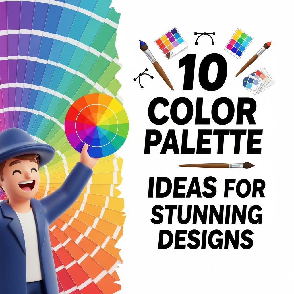
10 Inspiring Color Wheel Combinations for Stunning Designs
Discover 10 creative color wheel inspirations that will elevate your design projects and captivate your audience with stunning visual appeal.
Designing with color can be both an exhilarating and daunting task. The right color palette has the power to evoke emotions, convey messages, and bring your vision to life. Color theory provides a systematic approach to understanding how colors interact and influence one another. In this article, we will explore ten color wheel inspirations that can elevate your designs and provide insight into how to effectively use color in your projects.
Color can dramatically influence the mood and perception of your designs, making the right combinations essential for effective branding. In this guide, we’ll explore 10 inspiring color wheel combinations that can elevate your logo designs to stunning new heights. For those looking to showcase their work, you can download stunning logo mockups to help visualize these beautiful color pairings.
Table of Contents
The Basics of Color Theory
Before diving into specific color combinations, it’s essential to grasp the foundation of color theory. The color wheel, first developed by Isaac Newton in the 17th century, displays colors in a circular format, allowing designers to easily see the relationships between hues. The wheel is typically divided into primary, secondary, and tertiary colors:
- Primary Colors: Red, Blue, Yellow
- Secondary Colors: Green, Orange, Purple (created by mixing primary colors)
- Tertiary Colors: Combinations of primary and secondary colors (e.g., Red-Orange, Yellow-Green)
Understanding Color Harmony
Color harmony refers to the aesthetically pleasing arrangement of colors. When creating a design, consider one of the following color harmony strategies:
- Complementary Colors: Opposite colors on the color wheel create high contrast and vibrant designs.
- Analogous Colors: Colors that are next to each other on the wheel create serene and comfortable designs.
- Triadic Colors: Three colors evenly spaced around the wheel, offering a vibrant yet balanced palette.
- Tetradic Colors: Two complementary color pairs, allowing more variety in designs.
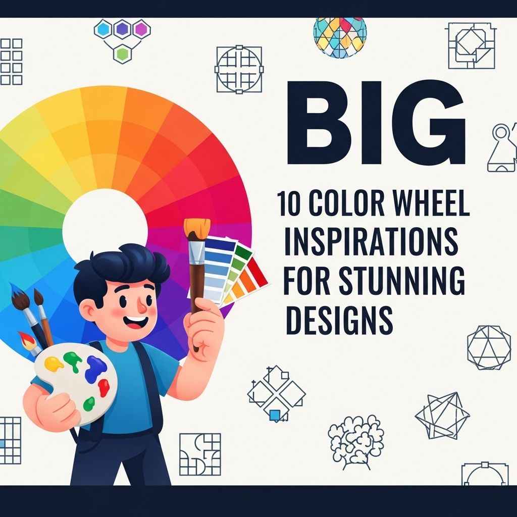
Color Wheel Inspirations
1. Monochromatic Elegance
A monochromatic color scheme utilizes variations in lightness and saturation of a single hue. This approach creates a cohesive and sophisticated aesthetic.
2. Complementary Contrast
Using complementary colors like blue and orange can create dynamic and eye-catching designs. This strategy is particularly effective for creating striking visuals:
| Color 1 | Color 2 | Hex Code |
|---|---|---|
| Blue | Orange | #007BFF / #FF5733 |
3. Soft Analogous Schemes
Analogous colors like green, blue-green, and blue create a harmonious effect perfect for serene applications such as spa websites or nature-themed projects.
4. Vibrant Triadic Combinations
Triadic color schemes, such as red, yellow, and blue, provide a bright and energetic feel. These combinations work well for playful designs aimed at younger audiences.
5. Earthy Tetradic Themes
Pairing earthy tones like brown, orange, green, and blue can create a warm, rustic vibe, ideal for brands focused on sustainability or organic products.
6. Soft Pastel Palette
Pastels evoke a sense of calm and nostalgia. A combination of soft pink, lavender, and mint green can be perfect for branding in the beauty or wellness industry.
7. Bold Black and White
A classic black and white scheme with a pop of color (like a bright red or yellow) creates a modern and striking look. This approach is often utilized in minimalist designs.
8. Neon Brights
For a youthful and energetic vibe, incorporating neon colors such as electric blue, hot pink, and bright green can attract attention and make a statement.
9. Rich Jewel Tones
Deep colors such as emerald green, sapphire blue, and ruby red can evoke luxury and sophistication. These hues are excellent for high-end brands or exclusive events.
10. Seasonal Inspirations
Colors inspired by the seasons can bring a design to life. For instance:
- Spring: Soft pastels like light pink, lavender, and mint
- Summer: Bright colors like turquoise, sunny yellow, and coral
- Autumn: Rich hues like burnt orange, mustard, and deep red
- Winter: Cool tones like icy blue, silver, and dark green
Applying Color Theory to Your Designs
When applying these color wheel inspirations to your designs, consider these tips:
- Experiment: Use design software to test different color combinations before finalizing your palette.
- Understand Your Audience: Tailor your color choices based on the emotional responses you aim to elicit from your target audience.
- Maintain Brand Consistency: Ensure colors align with your brand identity for cohesive marketing.
Conclusion
In conclusion, the color wheel serves as a powerful tool for designers seeking to create visually appealing projects. By understanding color theory and exploring various inspirations, you can develop unique color palettes that resonate with your audience. Whether you’re creating a logo, a website, or packaging, the right colors can significantly impact the effectiveness of your design.
FAQ
What is a color wheel and how is it used in design?
A color wheel is a circular diagram that organizes colors according to their relationships. Designers use it to create harmonious color schemes and to understand the interactions between colors.
How can I use the color wheel to create stunning designs?
You can use the color wheel to select complementary, analogous, or triadic color schemes that enhance the visual appeal of your designs and create a balanced composition.
What are complementary colors on the color wheel?
Complementary colors are located directly opposite each other on the color wheel. Using these colors together creates high contrast and visual interest in designs.
What is the difference between warm and cool colors on the color wheel?
Warm colors, such as reds and yellows, evoke energy and excitement, while cool colors, like blues and greens, create calm and relaxation. Understanding this can help you convey the right emotions in your designs.
How can I find inspiration from the color wheel for my projects?
To find inspiration, explore various color combinations on the wheel, consider the emotions they evoke, and look at how other designers utilize these combinations in their work.
Can the color wheel help with branding and logo design?
Yes, the color wheel can guide you in selecting colors that represent your brand’s personality and values, ensuring that your logo is appealing and memorable.