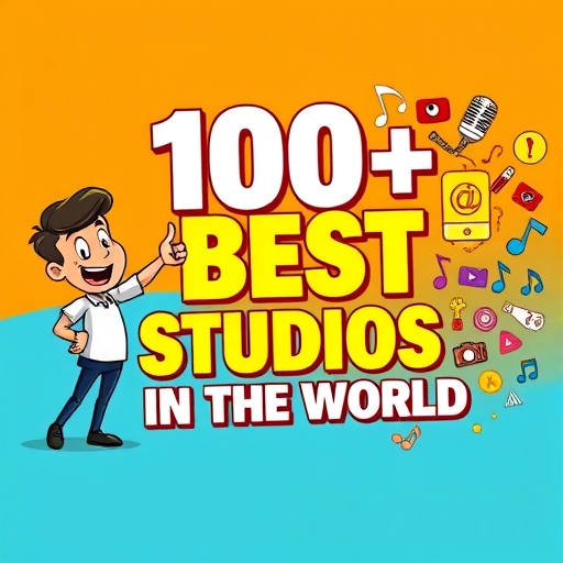
A Guide to Eye Catching Poster Design


Most of us have tried to make posters at some point, whether it was for self promotion or a client. Posters can be a fun way to present your message and do some interesting things with design. Posters are an effective way to draw attention to your sales, events, fundraisers and more.
Creating an eye-catching poster is essential for capturing attention and conveying your message effectively. This guide will explore key design principles, techniques, and inspiration to elevate your poster creation process. For practical application, check out these editable coffee cup designs to see how mockups can enhance your visual projects.
While there is no one correct way of creating a poster, but there are some tips that would help you to come up with a professional design approach to you poster. Here are some tips to help you out!
Identify The Goal
First of all get a clear picture of the objective of your poster. Whether you want to inform about a new product or want to announce an event, etc. Once the objective is clear, it will guide your design choices.
For example, if the goal of your poster is to inform people about a new movie release,or about a sale, then your poster should be designed strategically to help you achieve this goal.

Consider your target audience
Next, you should consider who you are trying to reach with your poster. Answering this question will probably inform a lot of your design choices. For example, say you’re advertising a fundraising event for the arts. If you want to reach out to older and professional audience then you can give the layouts, colors, and design a professional look.
Create a hierarchy of information
Make your poster easy to read from a distance. What information you choose to include on your poster will depend on the goal of your poster. But if you’re creating a fairly standard poster, it’s best practice to follow a hierarchy of information. You can think the text of your poster as having three distinct layers:
- Headline: This is the main (and largest) text element in the design. It can be in addition to an art element or it can be the art element. Opt for a readable typeface that is interesting and demands attention.
- Details: What, when, where? Answer these questions in the second level of the text. What information does someone need to do what your poster is asking of them? Provide the information here in a concise manner. As for sizing, there are two options – drop the size to about half of the main headline for very clear hierarchy or continue to use a larger size and use another technique for contrast. (The choice often depends on other elements and importance of secondary text.)
- The fine print: This one explains itself. Commonly seen on posters to promote movies, it’s everything else that someone decided needed to be on the poster. Make it small and keep it out of the way.
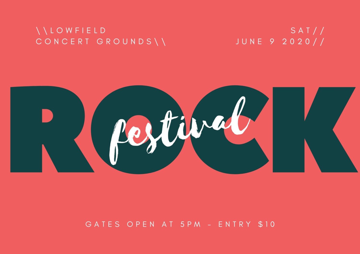
Maintain the Contrast
You have one glance to grab someone’s attention with a poster. High contrast between elements can help you do that. Think about a big color background as well. Many times poster designers start with a white canvas. Try use a high color background with a full bleed to make your poster stand out from all the rest.
Also, it is better to know where your poster is going to be located. Knowing where the design will live can help you make choices about how to create it. Not only is visual contrast important within your design, it is an important external factor as well. Think of it this way: If your poster is going to hang on a green wall, you probably want to use a contrasting color scheme so the design does not blend into the environment.
Use Plenty of Space
When it comes to posters, use exaggerated spacing between elements. It may look a little funny to you at first, but the extra spacing will dramatically increase visual impact and readability at distances.
There are a few places where extra space can work wonders in poster design like between individual letters, lines of text, around interior margins of the canvas and most important element in the design, etc.

Create Focus with Typography
Poster design is one of those places where you can really go crazy with beautiful typography. Some of the best posters are made with type and color, with no images or illustrations.
Keep the same typography principles in mind that you would with any other project – this is not the time to use 10 fonts in one location. But do experiment with bolder, wider, bigger typefaces that you might feel comfortable with otherwise.
Start with a pre-made poster template
If you don’t have a ton of design experience (or any, for that matter), designing your own poster might be intimidating. A poster template will give you a foundation to create your own design.
- Look for a poster template with a layout that fits your vision and goals.
- Pick a poster template with the right dimensions for where you will be sharing your poster.
- Customize your templates if there are aspects of the design that you don’t like.
Pick a relevant or branded color scheme
One of the first things that someone is probably going to notice about your poster is the color scheme.
In most cases, the appropriate color scheme will be obvious. For example, if you’re creating a poster for a winter event, then a color scheme of warm red and white will evoke the feeling of the holidays.
Poster designing is fun. While there are plenty of things to think about and consider, this is an area where you can break the rules and go a little crazy with design.
So take advantage of this. Try something that you wanted to do differently, or take opportunity to learn new techniques and create something fresh and unique. Get creative! It will definitely grab attention at a glance.
Happy Imagining!