
3 Stunning Fonts That Make Your Design POP
Discover three stunning fonts that will elevate your design and make it pop. Perfect for graphic designers looking to enhance their creative projects.
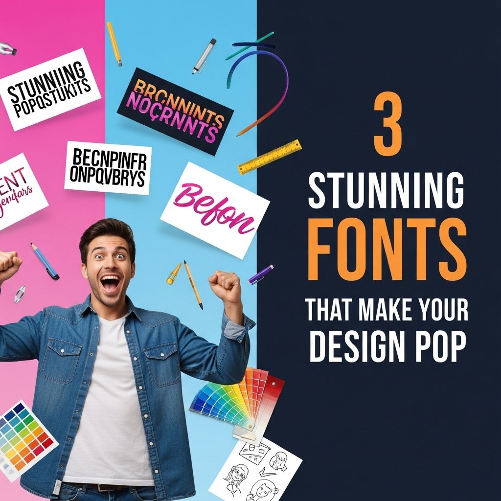
In the ever-evolving world of design, typography plays a crucial role in conveying messages and enhancing aesthetics. While colors and layout are important, the right font can elevate a design from ordinary to extraordinary. This article explores three stunning fonts that are sure to make your design pop, capturing attention and leaving a lasting impression.
Choosing the right font can elevate your design, making it truly stand out. Here are three stunning fonts that not only enhance aesthetics but also ensure your message is communicated effectively. To see how these fonts can shine in your projects, explore our logo mockup collection.
Understanding the Importance of Typography
Typography is more than just choosing a font; it is about creating a visual hierarchy and establishing a tone that aligns with the intended message. Here are some key reasons why typography matters in design:
- Readability: The right font improves readability, ensuring that your audience can easily consume your content.
- Brand Identity: Fonts contribute to brand recognition, helping to create a unique identity.
- Emotional Connection: Different fonts evoke different emotions, influencing how viewers perceive the message.
Font #1: Montserrat
Montserrat is a geometric sans-serif typeface designed by Julieta Ulanovsky. Inspired by the signage of the Montserrat neighborhood in Buenos Aires, this font is modern and versatile.
Features of Montserrat
- Geometric Shapes: Montserrat features clean lines and geometric shapes, making it suitable for both headings and body text.
- Wide Variety of Weights: It comes in multiple weights, ranging from thin to extra bold, allowing for flexibility in design.
- Excellent Legibility: The font is designed for legibility at various sizes, making it perfect for web and print applications.
Best Use Cases for Montserrat
- Web Design: Ideal for modern websites and portfolios.
- Branding: Great for creating logos and brand identity.
- Social Media Graphics: Works well in eye-catching social media posts.
Font #2: Playfair Display
Playfair Display is a serif typeface designed by Claus Eggers Sørensen. It combines traditional serif characteristics with a modern twist, making it perfect for elegant designs.
Characteristics of Playfair Display
- High Contrast: The font features a high contrast between thick and thin strokes, giving it an elegant and sophisticated look.
- Stylish Italics: The italic variations are particularly stylish, adding flair to your text.
- Large x-height: This feature enhances readability, especially in smaller sizes.
Optimal Applications for Playfair Display
- Editorial Design: Perfect for magazines and book covers.
- Luxury Branding: Ideal for upscale brands looking to convey elegance.
- Wedding Invitations: Great for romantic and sophisticated invitations.
Font #3: Raleway
Raleway is an elegant sans-serif typeface designed by Matt McInerney. This font was originally designed as a single thin weight and has since evolved into a family of weights, making it versatile and contemporary.
Key Features of Raleway
- Minimalist Design: The clean and minimalist design makes it a favorite among modern designers.
- Multiple Weights: Raleway includes a variety of weights, from thin to heavy, allowing for diverse design applications.
- Open Letterforms: The open letterforms enhance readability, making it suitable for both display and body text.
Best Uses for Raleway
- Digital Products: Perfect for app designs and software interfaces.
- Infographics: Works well in data visualization and infographics.
- Presentations: Ideal for creating sleek and professional presentations.
Comparative Overview of the Fonts
| Font | Type | Weights | Best For |
|---|---|---|---|
| Montserrat | Sans-serif | Multiple | Web Design, Branding |
| Playfair Display | Serif | Multiple | Editorial Design, Luxury Branding |
| Raleway | Sans-serif | Multiple | Digital Products, Presentations |
Conclusion
Choosing the right font is crucial in design, and Montserrat, Playfair Display, and Raleway each offer unique attributes that can elevate your projects. Whether you’re designing for the web, creating branding materials, or crafting elegant invitations, these fonts can enhance readability and aesthetics. Remember, typography is a powerful tool—use it wisely to make your designs truly pop!
FAQ
What are the best fonts for graphic design?
Some of the best fonts for graphic design include Helvetica, Futura, and Garamond, as they offer versatility and readability.
How can I choose the right font for my project?
Consider the mood and message of your project, the readability of the font, and how it complements other design elements.
What are some free font resources available online?
Free font resources include Google Fonts, Font Squirrel, and DaFont, which offer a wide variety of fonts for personal and commercial use.
How do fonts impact user experience in design?
Fonts affect readability, brand perception, and emotional response, which are crucial for a positive user experience.
Can I use multiple fonts in my design?
Yes, using multiple fonts can enhance a design, but it’s important to limit the number to maintain visual harmony.


