
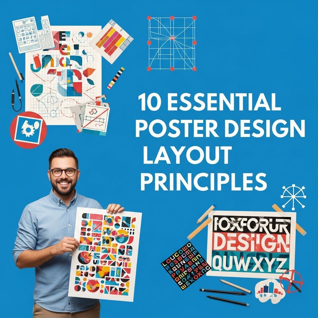
10 Essential Principles for Poster Design Layout
Discover 10 key principles for creating effective poster designs that capture attention and convey your message clearly.
Creating an effective poster involves more than just striking visuals; it requires careful planning and an understanding of key design principles. Whether for advertising, educational purposes, or artistic expression, a well-designed poster can grab attention and communicate a message effectively. In this article, we will explore ten essential poster design layout principles that can help you create visually compelling and informative posters.
Understanding poster design layout is pivotal for creating visually compelling and effective communication tools. This guide explores 10 essential principles that every designer should consider to enhance their poster layouts and ensure maximum impact. For inspiration, you might also want to discover unique logo mockup ideas.
1. Focus on Hierarchy
Hierarchy is critical in guiding the viewer’s eye to the most important elements of your poster. It can be established through size, color, and placement.
Key Elements of Hierarchy:
- Size: Make the title larger than other text elements.
- Color: Use contrasting colors to highlight important information.
- Placement: Position key information at the top or center of the poster.
2. Use Grids for Structure
A grid system helps create a structured layout, making it easier for viewers to follow the content. Grids can help align text and images, providing a clean and organized appearance.
Benefits of Using Grids:
- Maintains consistency across different sections.
- Facilitates alignment and spacing.
- Improves readability and visual flow.
3. Choose a Color Palette Wisely
Colors not only evoke emotions but also convey messages. The right color palette can enhance the effectiveness of your poster. Consider the psychology of colors when selecting your palette.
Tips for Choosing Colors:
- Limit Your Palette: Stick to 2-4 main colors to avoid visual clutter.
- Use Complementary Colors: Use colors that contrast well to make text readable.
- Consider Branding: Align colors with your brand identity if applicable.
4. Incorporate Visual Elements Strategically
Images, illustrations, and icons can enhance your message and make the poster more engaging. However, they should complement the text rather than overwhelm it.
Types of Visual Elements:
- Images: Use high-quality images relevant to your topic.
- Icons: Simple icons can help convey complex ideas quickly.
- Charts and Graphs: Use to present data clearly and effectively.
5. Balance Text and Visuals
Striking a balance between textual content and visual elements is essential. Too much text can overwhelm the reader, while too many visuals can detract from the message.
Finding the Right Balance:
- Keep text concise and to the point.
- Use bullet points or short paragraphs for readability.
- Ensure visuals serve a purpose in enhancing comprehension.
6. Ensure Readability
Readability is crucial for any poster. If the text is difficult to read, the message will be lost. Pay attention to font choice, size, and contrast.
Factors Affecting Readability:
- Font Choice: Choose sans-serif fonts for modern looks and serif for a classic feel.
- Font Size: Ensure the main text is large enough to read from a distance.
- Line Spacing: Use adequate spacing between lines for clarity.
7. Use White Space Effectively
White space, or negative space, is the area around your elements. It helps to create breathing room and can enhance focus on key parts of the design.
Benefits of White Space:
- Improves overall aesthetic quality.
- Draws attention to the focal points.
- Prevents overcrowding of content.
8. Create a Focal Point
A focal point is essential in directing the viewer’s attention. This could be a striking image, a bold headline, or an intriguing statistic.
Techniques to Establish a Focal Point:
- Use contrasting colors.
- Utilize larger sizes for emphasis.
- Incorporate geometric shapes to attract attention.
9. Maintain Consistency
Consistency in design elements such as color, font, and style creates a cohesive look. This helps reinforce the message and brand identity.
Ways to Ensure Consistency:
- Develop a style guide for fonts and colors.
- Use similar graphic styles across all elements.
- Keep layouts uniform for similar types of content.
10. Test and Iterate
Before finalizing your poster, it’s important to test it with your target audience. Collect feedback and be willing to make adjustments based on their responses.
Steps for Testing:
- Share drafts with peers or focus groups.
- Gather feedback regarding clarity and engagement.
- Make necessary revisions based on insights received.
Conclusion
By understanding and applying these ten essential poster design layout principles, you can create posters that are not only visually appealing but also effective in communicating a message. Good design is not just about aesthetics; it is about achieving clarity and engagement. So, take these principles into account the next time you embark on a poster design project, and watch your creations come to life with impact.
FAQ
What are the key principles of poster design?
The key principles of poster design include balance, alignment, contrast, hierarchy, repetition, and space.
How can I achieve balance in my poster design?
Achieving balance can be done by distributing visual elements evenly throughout the poster, ensuring that no section feels heavier than another.
What is the importance of contrast in poster design?
Contrast helps to draw attention to important elements, making text and images stand out, which enhances readability and visual appeal.
How do I establish a hierarchy in my poster design?
Establishing hierarchy involves organizing elements in a way that leads the viewer’s eye to the most important information first, often through size, color, and placement.
Why is space important in poster design?
Space, or white space, is crucial as it allows the design to breathe, prevents clutter, and helps to focus attention on key components.
What role does repetition play in effective poster design?
Repetition helps to create consistency and unity in the design, reinforcing the overall theme and making the poster more cohesive.


