
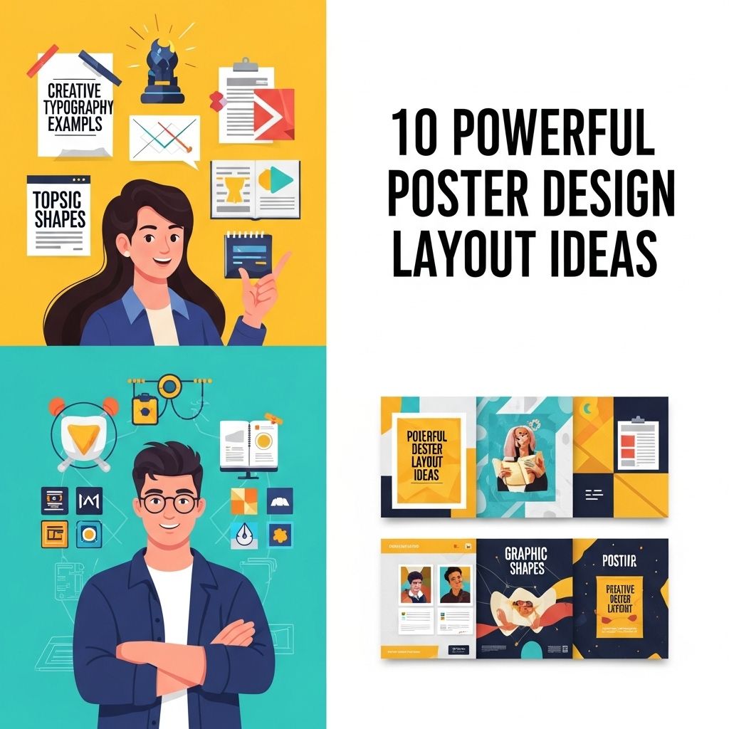
10 Powerful Poster Design Layout Ideas You Need to Try
Discover 10 innovative poster design layout ideas that will elevate your creativity and make your designs stand out.
In the world of visual communication, the power of a well-designed poster cannot be underestimated. Posters serve as a dynamic medium to convey messages, promote events, or even showcase artistic expression. As we delve into the intricacies of poster design, this article will explore ten powerful layout ideas that can elevate your designs from ordinary to outstanding. Whether you’re a seasoned designer or a novice looking to make an impact, these layout strategies will help you capture attention and communicate effectively.
Creating an impactful poster requires not just great content but also a powerful layout that captures attention. From grid systems to dynamic asymmetry, exploring diverse design layouts can transform your visual communication. For inspiration, you can view the latest logo mockup designs that showcase effective use of layout and style.
The Importance of Layout in Poster Design
Layout is fundamental in poster design as it dictates how the viewer interacts with the information presented. A successful layout guides the eye, emphasizes key elements, and enhances the overall aesthetic appeal. Here are some reasons why layout is crucial:
- Hierarchy: Good layout establishes a visual hierarchy, helping viewers understand the significance of different elements.
- Readability: A well-organized layout improves readability and ensures that messages are easily digestible.
- Brand Identity: Consistent use of layout reinforces brand identity, making designs recognizable.
1. The Rule of Thirds
This classic composition technique divides the poster into a grid of nine equal sections. By placing key elements along these lines or at their intersections, you create a more balanced and engaging design.
Implementation Tips:
- Use the rule of thirds to position the main subject and complementary elements.
- Avoid placing all text or visuals in the center; instead, distribute them across the grid.
2. Minimalism
Less is often more in design. A minimalist approach focuses on essential elements, allowing the message to shine. This layout is particularly effective for technology and corporate posters.
Key Characteristics:
- Ample white space to draw attention to the subject.
- Limited color palette, often monochromatic.
- Simple typography that enhances readability.
3. Asymmetrical Balance
Breaking away from traditional symmetry, asymmetrical layouts provide a dynamic and modern feel. This technique involves balancing elements of different weights and sizes to create visual interest.
Benefits:
- Enhances creativity by allowing more freedom in design.
- Attracts attention through unexpected arrangements.
4. The Z-Layout
The Z-layout guides the viewer’s eye in a Z pattern across the poster, making it effective for posters that need to convey multiple pieces of information.
How It Works:
- Start in the top left corner with a headline or key image.
- Move diagonally to the top right for supporting information.
- Continue to the bottom left for additional details.
- Finish at the bottom right with a call to action.
5. Grids and Columns
A grid system helps organize content in a structured manner. This layout is perfect for posters that include a variety of text and images.
Advantages:
- Ensures alignment and consistency across the poster.
- Facilitates the effective grouping of related information.
6. Circular Layouts
Circular layouts draw the viewer’s eye around the design, creating a sense of movement and engagement. These layouts are great for emphasizing a central theme or image.
Design Elements to Consider:
- Central image or text with supporting graphics radiating outward.
- Curved text or shapes that enhance the circular flow.
7. Layering and Overlapping
Layering different elements can add depth to your poster. This technique involves overlapping images, text, and shapes to create a visually appealing composition.
Best Practices:
- Use transparency to allow elements to interact without overwhelming the viewer.
- Ensure that key information remains clear and legible.
8. Color Blocking
Color blocking involves using bold and contrasting colors to create sections within the poster. This method helps to organize information and draw attention to different areas.
Considerations:
- Choose a limited color palette to maintain harmony.
- Use colors that reflect the brand or message of the poster.
9. Typography as a Focal Point
When typography is the star of your design, consider creating a layout where text is the primary visual element. Bold fonts and creative arrangements can transform a simple message into an eye-catching poster.
Tips for Success:
- Use a mix of font sizes and weights for emphasis.
- Experiment with text alignment and spacing to create rhythm.
10. Infographic Style
Incorporating infographic elements can help convey complex information in an easily digestible format. This layout is particularly effective for educational and data-driven posters.
Components to Include:
- Charts, graphs, and icons to visually represent data.
- Concise text to explain each visual element.
Conclusion
The art of poster design is a blend of creativity, strategy, and technical skill. By employing these ten powerful layout ideas, designers can create posters that not only capture attention but also communicate messages effectively. Remember that a successful poster design should reflect the essence of the message while engaging the audience visually. Experiment with these layouts, and don’t be afraid to innovate and personalize your designs for maximum impact.
FAQ
What are the key elements of a powerful poster design?
Key elements of a powerful poster design include a strong focal point, effective use of color, clear typography, balanced layout, and engaging visuals.
How can I choose the right color scheme for my poster?
Choosing the right color scheme involves understanding the emotions associated with colors, ensuring contrast for readability, and aligning with your brand or message.
What typography tips should I follow for poster design?
Use no more than two or three fonts, ensure readability from a distance, and choose fonts that reflect the tone of your message.
How do I create a balanced layout in poster design?
A balanced layout can be achieved by distributing visual elements evenly across the poster, using grids to align items, and ensuring that text and images complement each other.
What are some common mistakes to avoid in poster design?
Common mistakes to avoid include cluttering the design with too much text, using low-quality images, neglecting whitespace, and ignoring alignment and hierarchy.
How can I incorporate visuals effectively in my poster?
Incorporate visuals by using high-quality images or graphics that support the message, ensuring they are relevant, and placing them strategically to draw attention.


