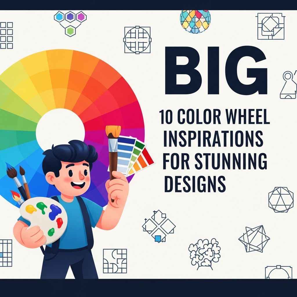
10 Stunning Color Palette Ideas for Your Designs
Explore 10 breathtaking color palette ideas that will elevate your design projects and inspire creativity. Perfect for any designer's toolkit!
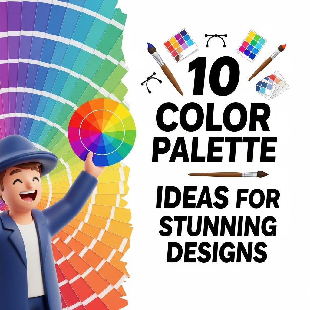
Choosing the right color palette is crucial for any design project, whether it’s for a website, branding, or artwork. The right colors can evoke emotions, convey messages, and create a harmonious visual experience. In this article, we’ll explore ten captivating color palette ideas that can elevate your designs and inspire creativity.
Choosing the right color palette is essential to creating visually appealing designs that capture attention and convey your message effectively. In this article, we explore 10 stunning color palette ideas to inspire your next project. For those looking to elevate their branding, you can also download stunning logo mockups to see these palettes in action.
Table of Contents
Understanding Color Theory
Before diving into specific palettes, it’s essential to understand some basic principles of color theory. The color wheel is a fundamental concept in design, showcasing how colors relate to one another. Here are some key terms:
- Primary Colors: Red, blue, and yellow; these colors cannot be made by mixing other colors.
- Secondary Colors: Green, orange, and purple; formed by mixing primary colors.
- Tertiary Colors: Combinations of primary and secondary colors.
- Complementary Colors: Colors opposite each other on the color wheel, creating a striking contrast.
1. Monochromatic Palette
A monochromatic palette uses variations in lightness and saturation of a single color. This approach creates a clean and sophisticated look.
Example Color: Blue
| Shade | Hex Code |
|---|---|
| Light Blue | #ADD8E6 |
| Medium Blue | #0000FF |
| Dark Blue | #00008B |
2. Analogous Colors
Analogous colors are next to each other on the color wheel and typically combine three colors. They create serene and comfortable designs.
Example Palette:
- Green (#008000)
- Green-Blue (#00BFFF)
- Blue (#0000FF)
3. Complementary Colors
Using complementary colors creates vibrant and intense designs. This palette contrasts warm and cool colors.
Example Colors:
- Red (#FF0000)
- Green (#00FF00)
4. Triadic Color Scheme
A triadic color scheme consists of three colors that are evenly spaced around the color wheel. This creates a balanced and colorful look.
Example Colors:
- Yellow (#FFFF00)
- Blue (#0000FF)
- Red (#FF0000)
5. Tetradic Color Scheme
The tetradic palette includes four colors, consisting of two complementary pairs. This vibrant scheme allows for rich combinations.
Example Palette:
- Orange (#FFA500)
- Blue (#0000FF)
- Purple (#800080)
- Yellow (#FFFF00)
6. Earthy Tones
Earthy tones evoke feelings of nature and calmness. This palette is perfect for organic and eco-friendly designs.
Example Palette:
| Color | Hex Code |
|---|---|
| Beige | #F5F5DC |
| Olive Green | #6B8E23 |
| Terracotta | #E2725B |
| Brown | #8B4513 |
7. Pastel Palette
Pastel colors are soft and soothing, making them perfect for designs aiming for a gentle aesthetic.
Example Palette:
- Pale Pink (#FFB6C1)
- Light Lavender (#E6E6FA)
- Mint Green (#98FF98)
8. Neon Colors
For a bold and eye-catching design, neon colors pack a punch. They are particularly effective in modern and youth-oriented projects.
Example Palette:
- Neon Green (#39FF14)
- Hot Pink (#FF69B4)
- Electric Blue (#8C00FF)
9. Deep Jewel Tones
Jewel tones are rich and luxurious, perfect for creating an elegant and sophisticated atmosphere.
Example Palette:
| Color | Hex Code |
|---|---|
| Emerald Green | #50C878 |
| Sapphire Blue | #0F52BA |
| Amethyst Purple | #9966CC |
10. Vibrant Summer Palette
This palette is bright and energetic, ideal for summer-themed designs.
Example Colors:
- Coral (#FF7F50)
- Turquoise (#40E0D0)
- Golden Yellow (#FFD700)
Conclusion
Selecting the right color palette is essential to successfully convey your design’s message and enhance its appeal. Experimenting with different combinations can lead to unique and striking results. Whether you choose a monochromatic scheme for elegance, or vibrant neon colors for energy, the options are endless. Embrace creativity and let colors transform your designs!
FAQ
What are some popular color palette ideas for stunning designs?
Some popular color palette ideas include complementary colors, analogous colors, monochromatic schemes, triadic colors, and earthy tones.
How can I choose the right color palette for my design project?
Consider the emotions you want to evoke, the target audience, and the purpose of the design. Tools like Adobe Color can help you create harmonious palettes.
What is a complementary color palette?
A complementary color palette uses colors that are opposite each other on the color wheel, creating high contrast and vibrant designs.
What are analogous color schemes?
Analogous color schemes consist of three colors that are next to each other on the color wheel, providing a serene and comfortable aesthetic.
How can I incorporate trendy colors into my designs?
Stay updated with color trends through platforms like Pantone and apply these colors thoughtfully in your designs for a modern look.
What tools can I use to create color palettes?
You can use tools like Adobe Color, Coolors, or Canva’s color palette generator to create and experiment with different color combinations.